Brand Guidelines
Logos
About the logo
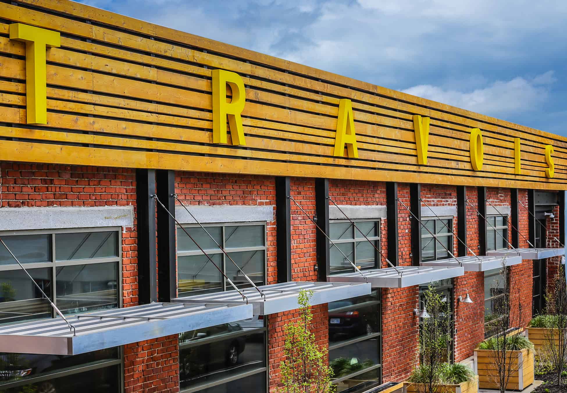
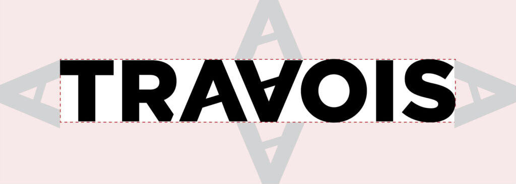
The Travois logo is a wordmark; bold, eye-catching, and straight-forward. The mirrored A and V contain a diagonal line, representing the triangular shape of a travois.
A travois is a transportation tool used by North American tribes to carry goods, formed by joining two poles. Our name and who we are is demonstrated in our tagline: You know where to go. We’ll pull the weight.
We are your Travois.
Logo lockups
Subsidiary logos are provided for Architecture, Housing Development, Asset Management and Compliance, and Economic Development. This allows the departments to be distinct while also part of the Travois brand family.
Logo colors
The logo can be used in several of the brand colors, as long as color accessibility is met (see Accessibility rules under the Colors tab).
The logo should coordinate and match the color used in the designed piece.
Use the black or white logo when you have bright and colorful images, so as to not compete. Use the color logo when the design is text or illustration only and you need an additional pop.
Logo sizing & spacing
Text and other graphic elements should remain outside the clear space to ensure the logo’s prominence and visibility. The minimum clear space is equivalent to the height of the letter A.
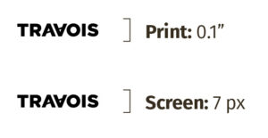
The minimum size ensures the legibility of the logo. It is measured by the height of the logo.
Incorrect usage
Avoid these common mistreatments to maintain the integrity of the logo and brand consistency.
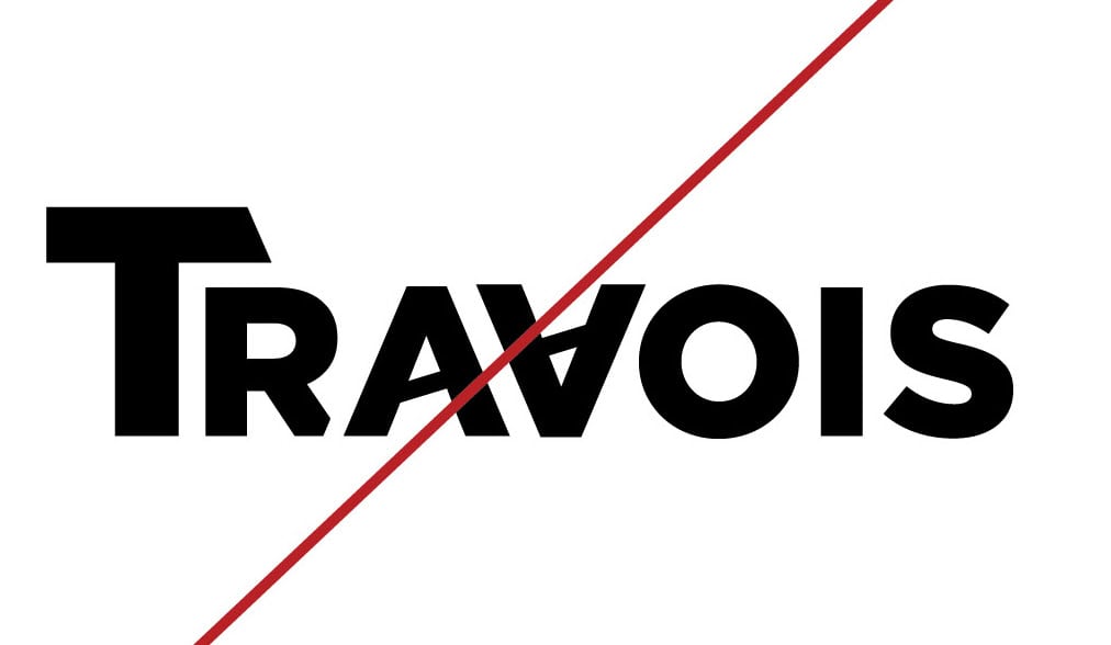
Don’t rearrange or modify. Use the logo files provided.
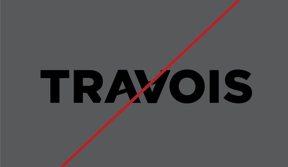
Don’t place over low contrast backgrounds. See colors page for accessible contrast color combinations.
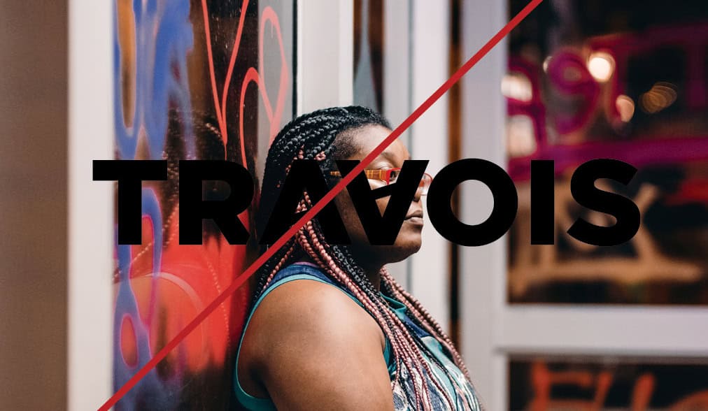
Don’t place over busy background images or people’s faces.
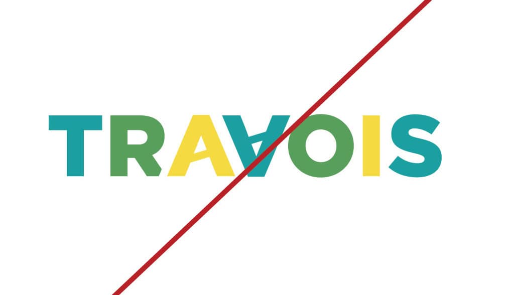
Don’t change the colors. Use the appropriate logo color provided.
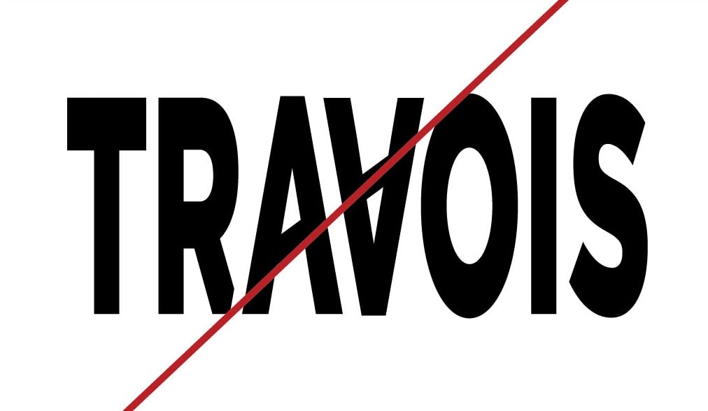
Don’t stretch or compress. Resize the logo proportionally.
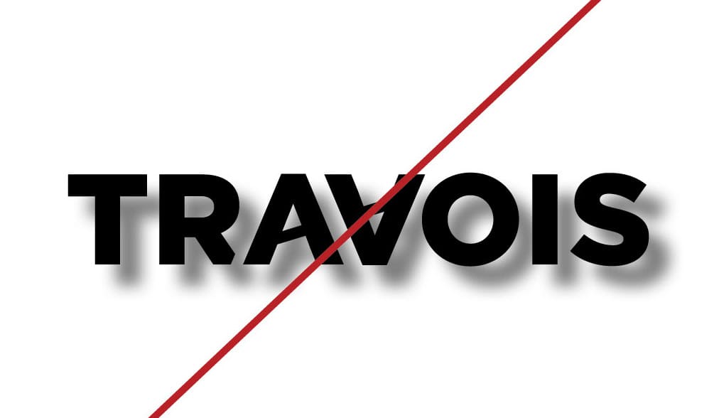
Don’t add effects like shadows, gradients or embossing.
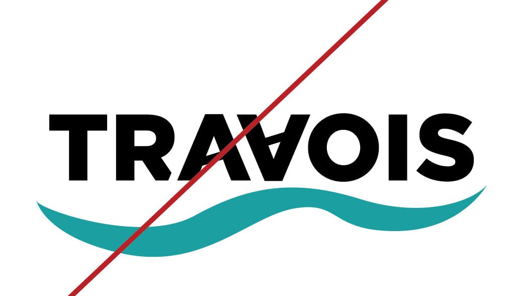
Don’t add other graphic elements
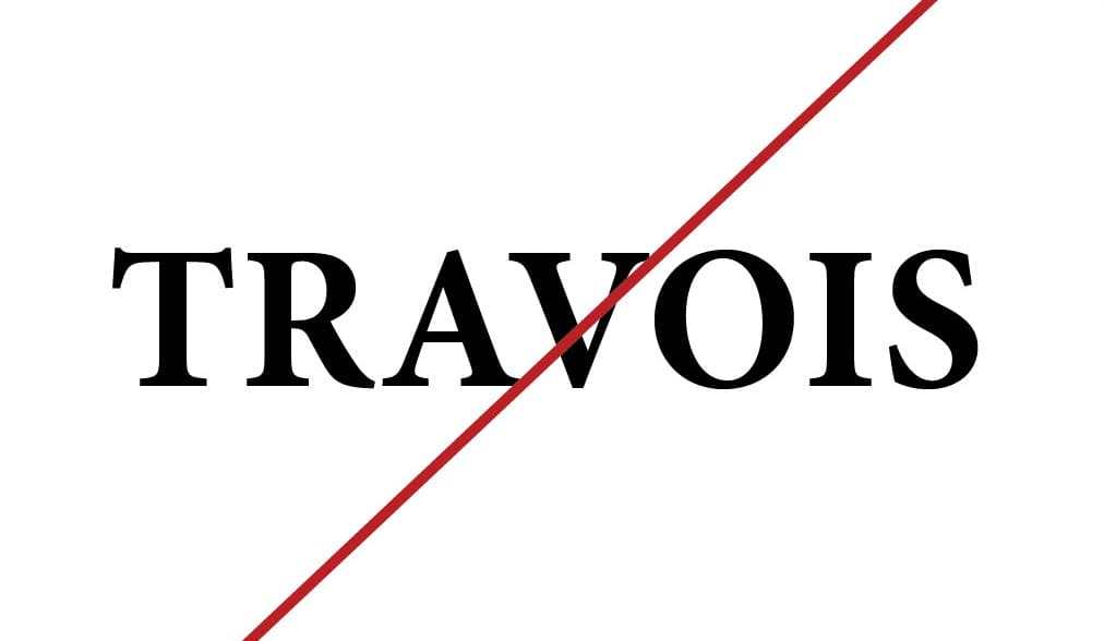
Don’t change the font.