Brand Guidelines
Typography
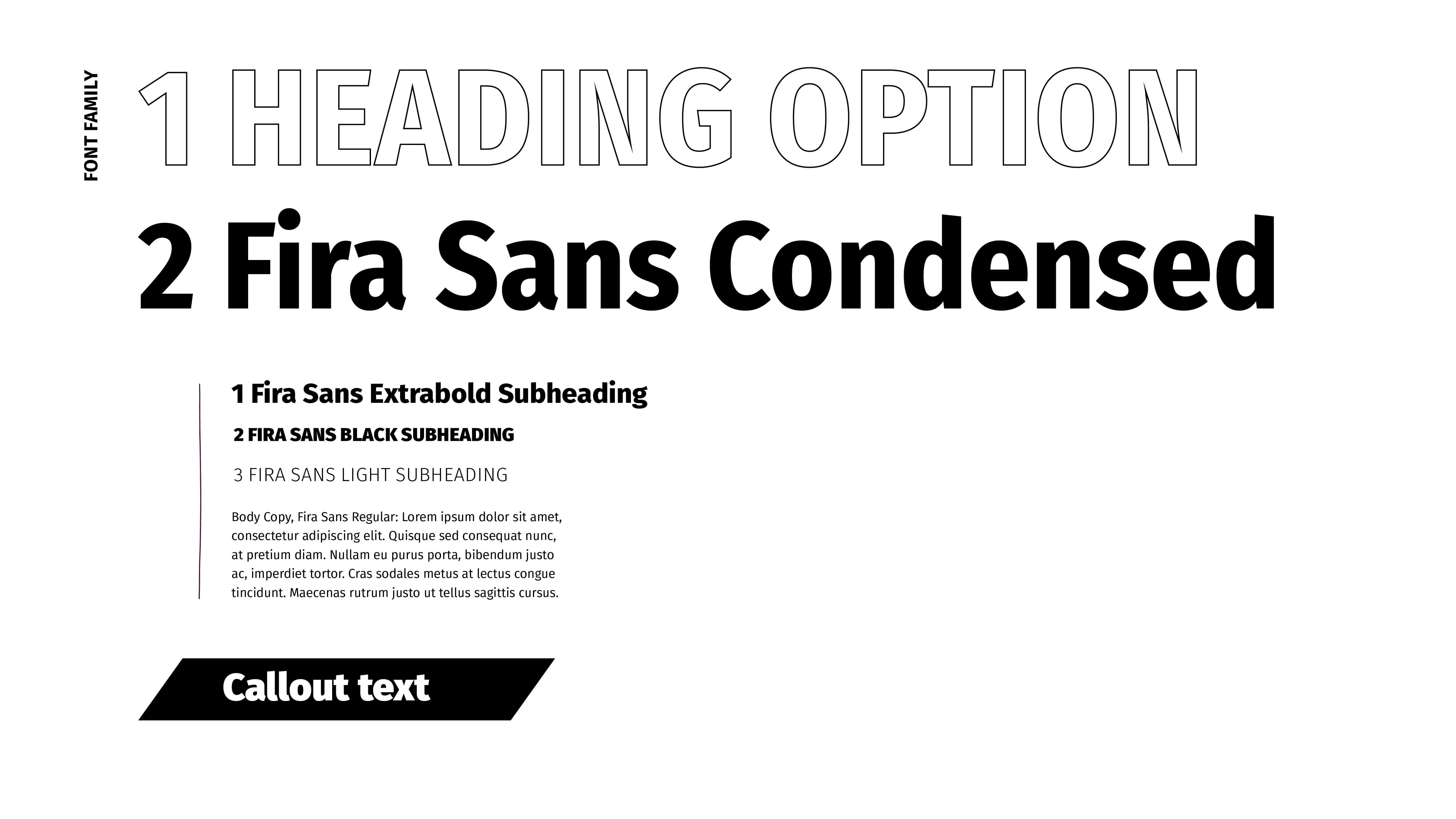
Our brand font family is Fira Sans, a google font.
Fira is a humanist sans-serif font, that is optimized for legibility on small screens. It is open and friendly, with a quiet elegance. It is available in nine different weights ranging from Thin to Black. For body copy please use Fira Sans Regular. For subheadings use Fira Sans Extrabold.
For headlines, to allow the words to be as big as possible, use Fira Sans Condensed Bold.
Another option for a headline is to use the outlines of Fira Sans Condensed Light in all-caps. The choice should be based on readability, for example, if the outlined font is placed over an image with enough contrast that can be easily read.